HANDLE EVALUATION AND CONTROL MAPPING
Company: Echonous is a medical device startup for miniature ultrasound devices.
Context: When the clinician is scanning a patient, both their hands are occupied -one hand is navigating the probe while the other is holding the tablet. In such a case, innovation lies in letting the user actuate buttons without letting go of the probe.
In this ambitious project, I was to identify a usable handle design, add controls on the handle and identify a location for the controls such that it fits all different hand sizes.
Project Goal: The goals of this project were a) to test the various handle designs; b) recommend the location of the buttons and c) map buttons to the ultrasound controls.
Title: Sr UX Lead

There were multiple ideas for handles, the one that made to prototype stage was a central puck idea that housed the battery as well as provided a good grip.
Initial drawings of Central Puck idea

Mid fidelity prototype testing
When the initial prototypes of the handle were tested, most people found it agreeable but not super comfortable. There was variability on the hold style based on hand sizes.

Initial Design
The initial design was too uncomfortable. I added clay putty on it so that it rests better on the palm of the users.

Usability Testing
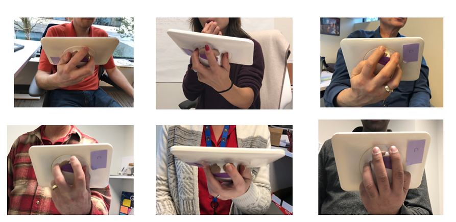
Different people with different hand sizes held it differently and their feedback led to the final design

Neutral Postures
During the test, special attention was made such that all the hand holds were in neutral postions.
HANDLE MAPPING TO CONTROLS
Three buttons were identified - left button, right button and a central trackpad.
The ultrasound controls that user needs while scanning are -
1) Freeze
2) Save Image
3) Save Clip
4) Increase/Decrease Depth
5) Increase/ Decrease Gain
The central button is used for arbitration and increasing and depth/gain controls, while the left and right buttons are dedicated for Freeze and Saving Image/clip.
Some clinicians are taught to hold the device with their left hand and some are taught to hold with their right hand regardless of them being left-handed or right-handed. As a UX designer I designed the interface to let them choose the mapping based on the user's preference.

USABILITY TESTING

More usability tests informed the designs. Every user had a slightly different way of holding the handle. It made me rethink the location and function of the buttons. Some said they would use their index finger, some said they would use the thumb to actuate the buttons. Two of the three buttons were easier to access and these two buttons were not the same. People found it most challenging to move along x axis on the 2D touchpad area. Based on the test results, the design evolved to have a 1D slider.
.jpg)
FINAL DESIGN
The usability studies that I conducted informed the final design. The 2D trackpad is replaced by the 1D slider. The cap sense button areas were made larger to accommodate all hand sizes.
WHAT'S NEXT
-
Formative studies completed successfully
-
Summative usability study planned
-
Very excited for the product to be launched in phase II of the product